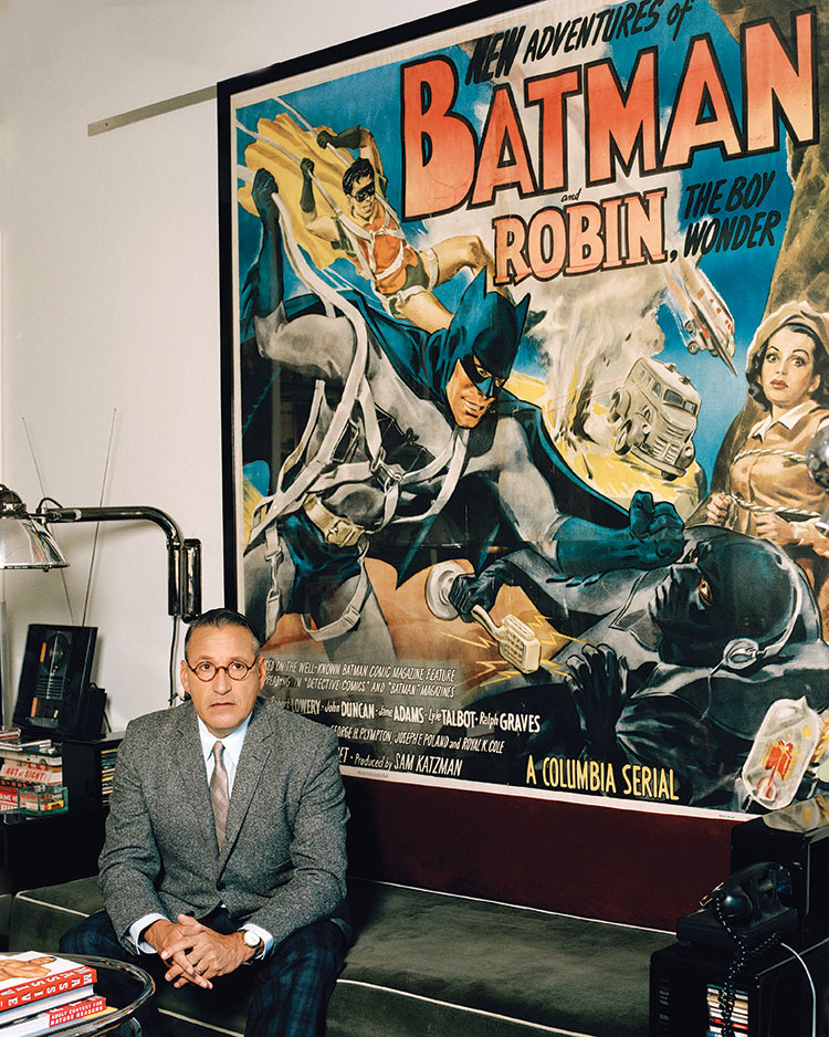
 Photo: Ryan Pfluger
Chip Kidd is an award-winning graphic designer and writer in New York. His groundbreaking book jacket designs for Alfred A. Knopf have elevated the form for close to three decades. He’s worked with hundreds of writers, including John Updike, Cormac McCarthy, Michael Crichton, Neil Gaiman and Haruki Murakami. As an editor and art director for Pantheon Graphic novels, he’s worked with and published some of the very best cartoonists in the world, including Chris Ware, Art Spiegelman, Dan Clowes, David Mazzucchelli and Charles Burns. He is the recipient of the National Design Award for Communications, and his TED Talk has been viewed over 1.6 million times.
Did you first read The Dark Knight Returns when it came out, or did you catch up to it later on?
CHIP KIDD: Oh, I was highly anticipating the original publication in the spring of 1986, and for months previous to that, probably a year. I was a senior in college at the time, on top of all the fan press, and there was a lot of it. I still have my copy of the fanzine ‘Amazing Heroes’ #69, which featured Miller’s Batman and Elektra meeting cute on the cover. That was April 1985, and such an image hadn’t happened before, or since for that matter.
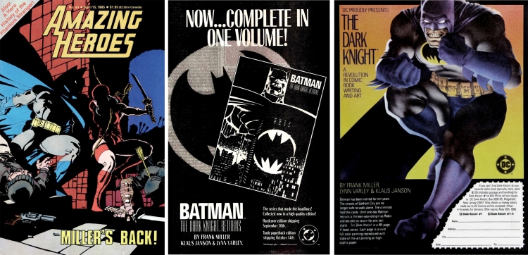
 Image: Rolling Stone Magazine #470 March 27 1986
Is there a particular image that stands out as your first encounter with the work?
CK: My first encounter with the TDK imagery itself was when it was previewed in, of all places, Rolling Stone magazine, and they used as the background for their contents page the art deco airbrush image of a giant looming Batman against the Gotham night sky, with the bat-signal shining off a skyscraper right out of Hugh Ferriss, the projection positioned where it would have otherwise landed on Giant Batman’s chest.
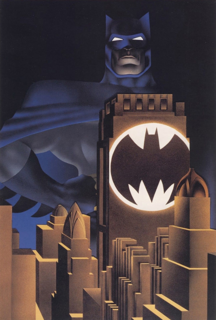
This is probably my favorite single image from the entire project, though it is stylistically at odds with the rest of the book. I have a feeling that this image’s reason for being was largely Lynn Varley’s doing, using her brilliantly wielded airbrush, and for that I say good for her. It is stunning. Does it aethsetically represent the actual contents of the book? Not really, but that’s okay. I never get tired of looking at it.
Do you think that the things you liked it in then are the same things you like it in now, or has the work changed meaning for you as you re-read it over the years?
CK: The work has definitely changed meaning for me over the years, I have read it so many times; and, like Watchmen, I see something new every time. What never ceases to amaze me is how the depiction of Batman and the general style of the artwork evolves so drastically throughout the series. When we first see Batman, that is pure tight-and-sleek Neal Adams. By the end, it is all visceral ten-pounds-of-potatoes-in-a-five-pound-bag Frank Miller. So amazing.
It seems like a lot of the hype around it at the time was that it was a “gateway comic” for people unfamiliar with what the medium had to offer. I would think that it’s the kind of book that only really works on someone who was familiar with the tropes of the superhero genre. What’s your experience with this?
CK: I agree with you, TDK didn’t feel like a starting off point for me at all, it was the opposite–an epic sending off. And yet the media hype was so intense that it probably played the jump-on role for a lot of people. God knows what they made of that.
 Image: reprint edition, designed by Chip Kidd
What of course really felt like the gateway comic was ‘Year One.’ When I started dating my soon-to-be-husband, I made him read it. He was a serious academic (quite serious, was head of the Yale English Lit department in the early 90s), and not into comics at all, but I said “If you don’t get this, you don’t get me.” So he read it, because he wanted to get me (!!), and he at least pretended to like it! But he was also a big fan of ‘Law and Order,’ and saw it as a really good episode of that, but with Batman in it. I totally agreed.
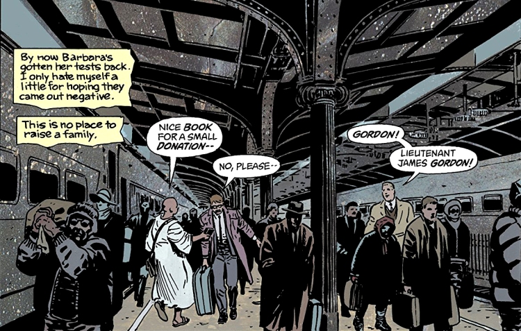 Image: Batman Year One
TDKR seems to address the central question at the heart of the Batman myth – what does Batman do with the Joker. If Batman does NOT kill him, the Joker keeps killing people = Joker wins. If Batman DOES kill him, it means that Joker has pushed Batman to break his own moral code = Joker wins. Do you see Batman as a doomed character? Does Miller’s take on it mark and end point and finality to this central conflict?
CK: I was/am just so impressed with how Miller solved the whole Joker quandary. It’s perfect. Previously, I hadn’t thought Batman doomed in this respect, just painted into a corner, as it were. But that was fun, as a fan in the 1970s, before it all got so grim. ‘The Joker’s Five-Way Revenge’, ‘The Laughing Fish.’ and all that. Loved!
The straight read of Miller’s narrative has the Joker snapping his own neck at the end of their final fight, but an interesting thing happens in that last moment – there is a slight shift in the color system Miller has built up for each character’s inner dialogue. Batman is gray, Robin is yellow, Superman is blue and the Joker is green.
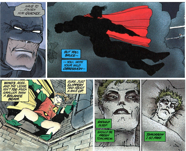
But in their last moment together the color code used for Joker’s dialogue is Batman’s gray. I like entertaining the idea that Batman actually kills the Joker, but in a half delusional state talks himself into believing his own lie – a lie that absolves him from breaking his moral code and allows him to walk away with his psyche still intact. That at the end the Joker “snaps his own neck” etc.
 Image: Original TDKR color proof page
I fully acknowledge that this was probably not intentional, but have you ever heard Miller address this at all? It’s really the only time it happens in he book.
CK: I hadn’t noticed that, very interesting. You really may be onto something there, I will ask Frank about it next time I see him, honest. I am thinking it wasn’t as you surmise, but who knows?
What’s your favorite page in TDKR and why?
CK: Well, in the interest of full disclosure, I own the originals to pages 11 and 42 of Book 3–they are framed and on the wall of my apartment, and I look at them every day. And they are signed to me by Frank, so they have deep meaning for me.
Are there any details that stick out as interesting, or telling about Miller’s process in them when looking at the original art?
There are several things–first, the use of paste-up photostats. Especially on my page of issue #3. Dialogue that was added later– “That’s right, Joker,” “WASTE those bullets”, do not appear on the original, but the other dialogue does (‘Watch your language, son…”). The last two panels of that page are stats, as is some of the sound effects (BLAM!!), and who knows where the originals are, or why they changed, or from what.
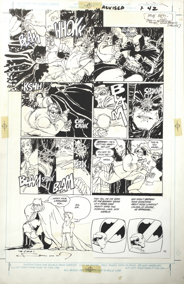 Image: Original art for book 3, page 42
What’s your favorite panel in TDKR and why?
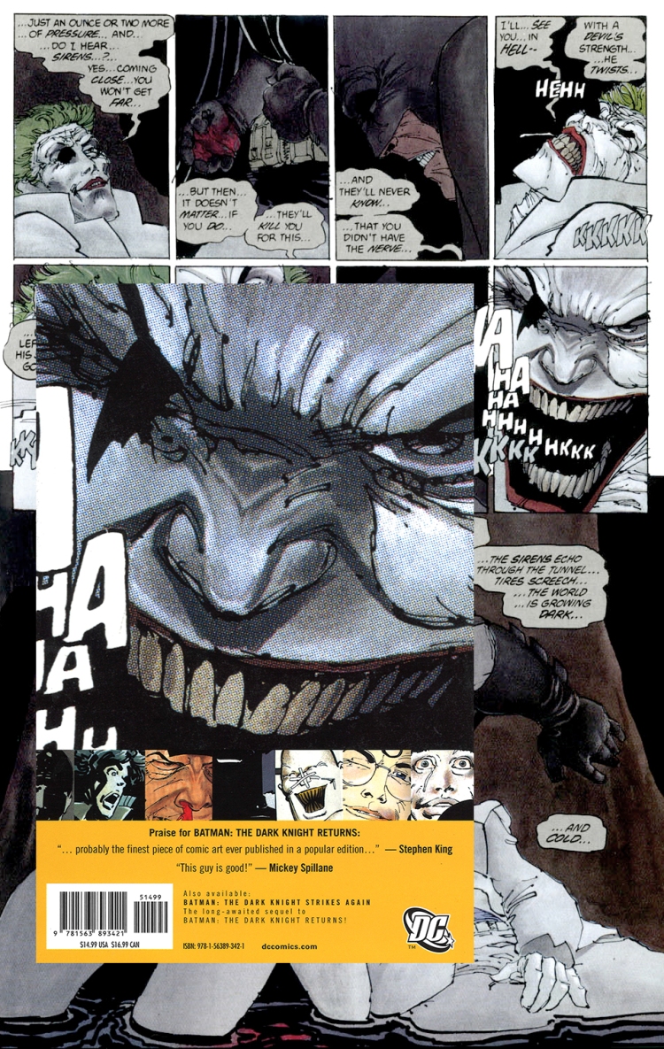
CK: Batman grimacing next to the dead Joker at the end of #3. “…The world…is growing dark…and COLD…” Just devastating, I’ll never forget reading and seeing that for the first time, I shuddered in awe. Stupendous.

The way Batman’s lower lip is descended and his bottom set of teeth bared like that display the despairing sense of finality. Also the way his ‘underwear pants’ are pulled so far up make him look so uncomfortable!! And yet he still looks so sturdy and strong, and the Joker looks alive and dead simultaneously. What a tableau, the anti-Pieta.
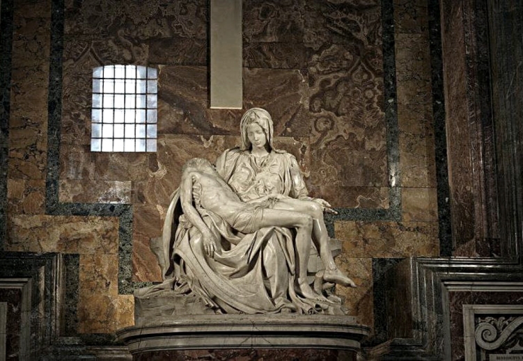 Image: The Pietà by Michelangelo
Can you talk a bit about what kind of headspace you were in when DC asked you to do the book design for a TDKR reprint? Was this a difficult project for you because you liked the work so much, or was it easier because you liked the work so much?
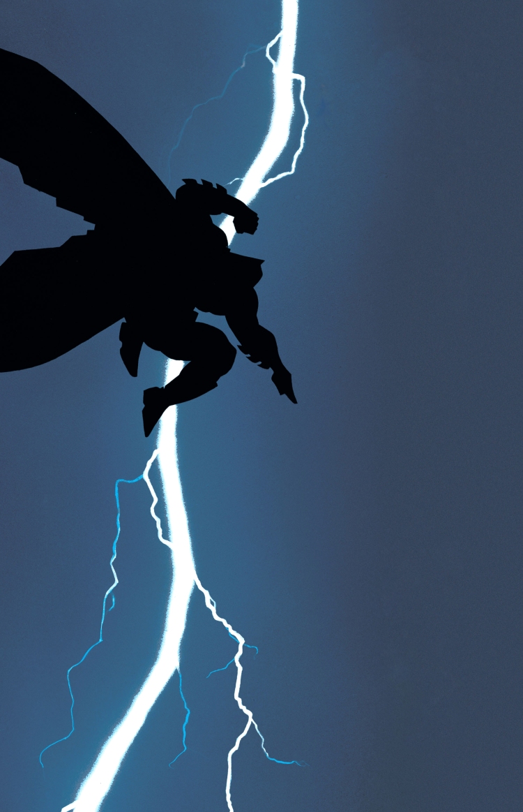
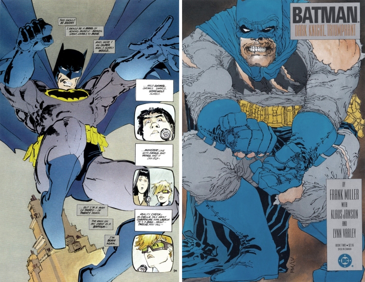
CK: First, let me say: I did this because Frank personally asked me to. And WOW, I will be forever grateful for that as a fan. What happened was, he requested through DC Comics that I design the hardcover collected first edition of ‘The Dark Knight Strikes Again’, and thus a re-design of ‘The Dark Knight Returns’ to go along with it. There was no way I would say no, but fuck!! What an intimidating challenge! The original TDKR cover was so iconic (the field of midnight blue, the little black figure, the lightning bolt), how would I ever improve on that? So I didn’t really try to, I just came at it from a literally different perspective. A completely different color palette, multiple images that worked on a change of scale that I had made something of a trademark: One large dominant inscrutable (but unmistakeable) form played against a smaller series of faces in extreme distress, almost like a film strip. Very utilitarian typography so that it didn’t distract from the pictures. A yellow belt was natural, for reasons I don’t think I need to explain.
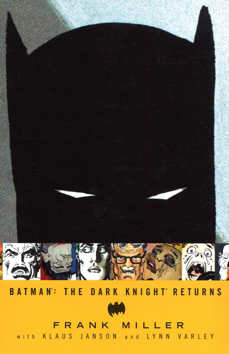 Image: Reprint edition, designed by Chip Kidd
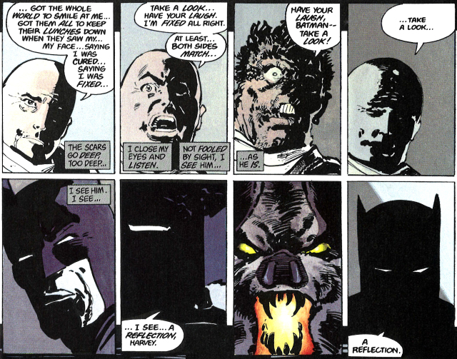
Part of the superhero comic art fandom leans towards a love for detailed drawings. Was it important for you to go the other way and present a stripped down image of Batman as the main image?
CK: Frank said: “You have a whole book of art to work from, you don’t need me to do anything new. Go for it.” And that REALLY freed me up–yay, I got to play magpie!! He was by then familiar with (and a fan of) the book design work I had done for Charles Schultz and Peanuts, and Jack Cole and Plasticman, and how I ‘repurposed’ printed drawings by blowing them up and exploiting the old printing process to evoke a renewed sense of perspective on the work. So that’s what I did for him. I was always fascinated by that interrogation scene with Harvey Dent at the end of issue #1 (“A reflection”) and that last panel was it for me. That was a cover, you couldn’t miss with it: a giant black mass, white narrowing slits for eyes. Batman would be huge this time, not a small floating figure, but a solid foundation looming large over the rest of the mayhem and keeping it in check. This seemed perfectly right–not an improvement on the original, just an alternative view of what was going on inside the book. And formally, I think it’s much more direct. Eye contact with the viewer always is.
Did the solution for the main cover image happen fairly early in the process, or were there many different test trials for it that almost made the cut?
CK: Re TDKR, there were a few alternative sketches I did, mostly lame, not of interest. We all knew which one was the best. HOWEVER, the hilarious thing was that when Frank had initially asked DC that I do the design, they said “Okay, we’ll ask him, but you’ve got to let him do his thing.”
 Image: Reprint edition, designed by Chip Kidd
And then Frank and I decided on just Batman’s eye on “Strikes Again” apparently DC flipped out and tried to reject it. It was too abstract for them, they thought it didn’t look like Batman anymore (!!). So then it was total role-reversal, and Frank had to insist that they go with it. Which obviously they did, but very reluctantly. They use it in reprints to this day, so it must have done okay for them ;-))
I love the slightly off kilter Batman logo on the cover with the type, was this taken from somewhere inside the comic or was it constructed from scratch?
CK: That logo drawing is from Page 46 of the first issue, that is the Bat-symbol as projected onto the building above and behind where Batman and Gordon are talking in the first panel.
![]()
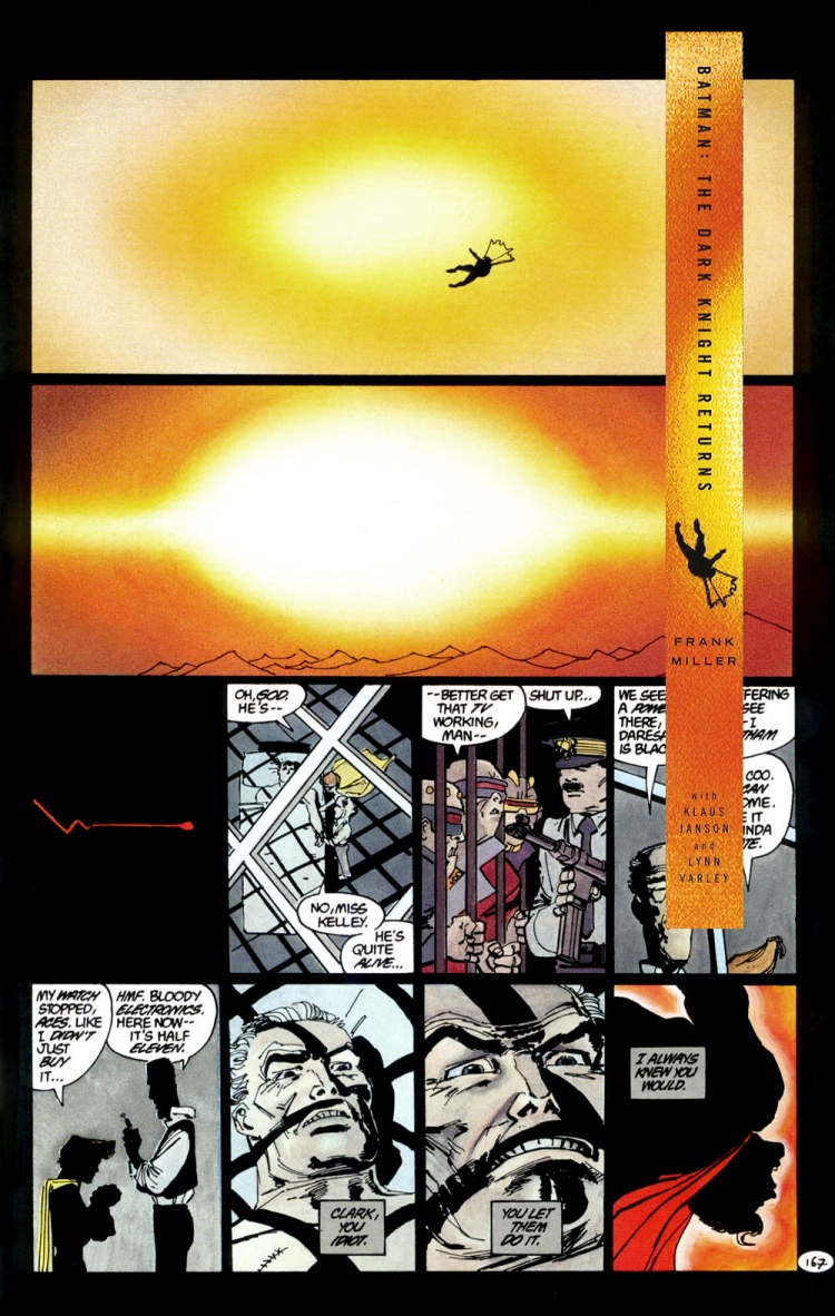
What image in the book was cropped to use on the spin?
CK: The image on the spine is from page 167 (fourth issue) showing Superman being blown away by the nuclear bomb (turned it 90 degrees clockwise).
And what typeface did you use for the text on the cover?
CK: The typeface is from the Trade Gothic family.

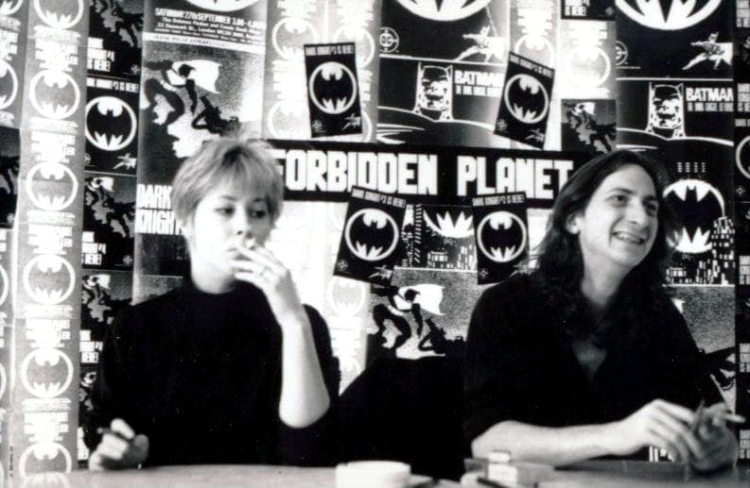 Image: Lynn Varley and Frank Miller signing at Forbidden Planet 1986
