I can’t help myself – when I go to record stores, sooner or later I find myself in the Bob Dylan section. Seems reasonable, but I’m usually trying to spot if they have one of my least favorite albums of his: Bob Dylan’s Greatest Hits. Problem is, I already own it. Three times. If they have a copy, I quickly open its dusty side pocket to see if I’m bringing another one home with me. I can’t help myself.
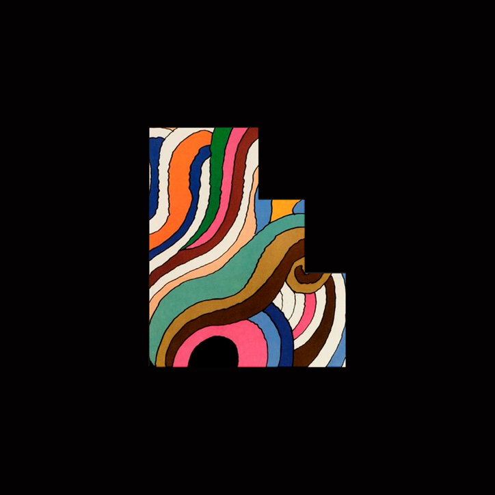
In 1967, when Columbia Records released the album each copy was accompanied by a beautiful poster designed by Milton Glaser. It’s rare to see one still slipped inside an old copy, but when it happens I bring it home. I really love this poster and have looked at it a lot. Two full sized copies are framed in my living room, next to each other. When people come over, we refer to it as our Double Dylans. Mr. Glaser was kind enough to talk to me and answer a few questions about it all.
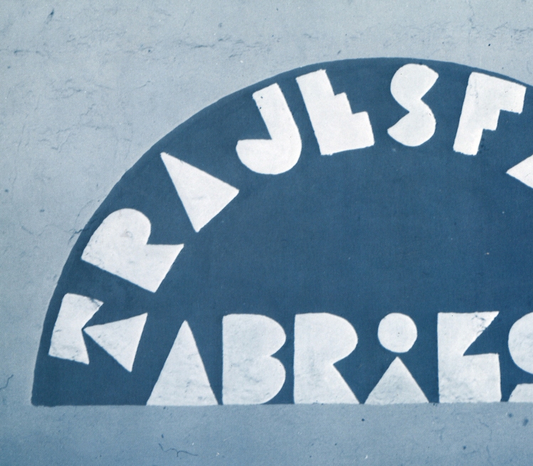
I’ve heard that the aesthetic of the Babyteeth typeface you used in the Dylan poster emerged from a sign you saw in Mexico. What attracted you to this sign and how did it influence the tone and personality of the other letters you made?
Milton Glaser: I saw this strange sign and was intrigued by the sort of innocence of the E and the fact that if you knew anything about typography you would never do a thing like that, the funny little staircase. There were a couple of other letters that also were primitive and simple in their reduction of letter forms and they sort of gave me a clue to a way to do a simple minded flat typeface.
So, the naive element of how unreadable it was attracted you?
Actually it’s the opposite. It’s how readable it was even though it deviated from our understanding of what an E is supposed to be. I’m always interested in the nature of perception and how much you understand from limited information. That issue of being able to understand what you’re looking at has always been such throughout my work. I’m interested not so much in its peculiarity but in its recognition.
Was Babyteeth specifically made for the Dylan poster, or was it something you were working on before and had around?
That was just an accident. I kind of had it on my desk at the same time. And I said if I have to use the word Dylan I’ll use this typeface largely because there wasn’t anything that looked quite like that around and I wanted to make the word itself look peculiar.
You’ve stated that the best work of an artist or designer emerges from unifying separate occurrences. Can you talk about the separate occurrences that came together to help shape the Dylan poster?
My idea is that you link things that are unrelated; it’s ninety percent of the imaginative content of what you do. The interesting thing is that firstly everything is connected, and secondly – once you find the connection it seems inevitable.
The Dylan piece is directly derivative from the self-portrait out of cut paper that Duchamp did. I saw it for the first time and was astonished at the amount of energy and power it had from a simple black silhouette. No technology that was impressive or anything – it was just this black profile in the corner of a piece of paper and I said Jesus! look at the energy that that releases. And it was just in my mind and I thought, I could do that with Dylan.
Than I thought that it was too austere and too easily understood and I was also interested in Islamic painting and so I said I’ll take a little piece of this decorative Islamic idea and combine it with a very unlikely self portrait by Duchamp and see what comes out for Bob Dylan. And that’s what I meant earlier – that connecting seemingly unrelated events is one of the essential tools of artists.
I haven’t checked the dates, but were you around when he was in NY?
He was around. In fact Duchamp quite coincidentally had a studio on 14th street next to mine. I rented a little room to paint in and Duchamp was right down the hall. I never had a long conversation with him outside of do you have the keys to the bathroom but he spent all his time playing chess by mail. And he never did any artwork during that period. This was late in his life.
His readymades greatly puzzle me, I’ve always had a hard time getting my head around it all.
It’s hard to talk about an understanding of them for they are meant to be confusing, transgressive and provocative. Above all what they don’t want to be is explained in a literal way. You have to understand that at a certain point the logic involved in explaining a piece of art collapses, because you can’t explain art through logic.
Art occupies another part of the brain, it doesn’t affect your neurology in the same way. And all attempts to be analytical about this stuff turns out to be nonsense, or a good part of it is. So you have to respect the unconscious function and the profound mystery of art making without trying to analyze every gesture and thought because mostly that’s bullshit.
The iconography of Dylan seems like a dream canvas to be molding and commenting upon, what did he mean to you then and what does he mean to you now?
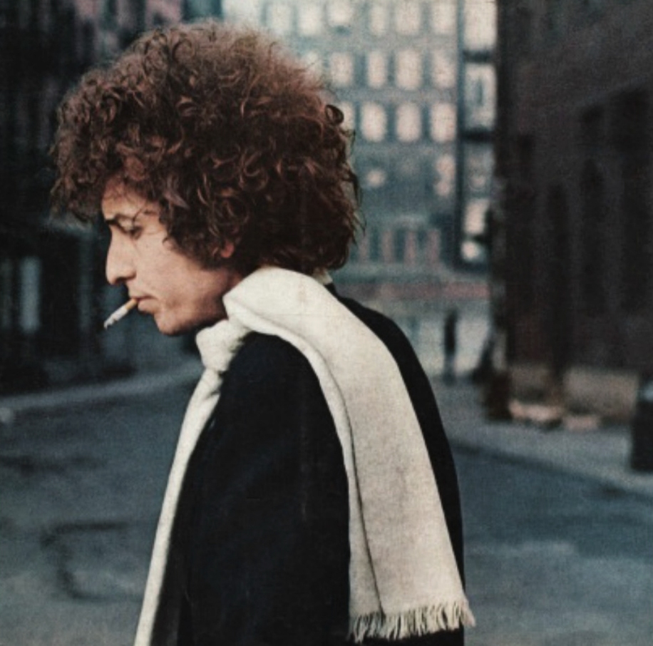
I liked Dylan very much. I knew him. He was represented by Albert Grossman, who is a good friend of mine. And I would see him occasionally, actually I haven’t seen him since I did that poster which is a very long time ago. He was just one of the true poets and artists around who’s work moved you in a way that went beyond entertainment.
The poster you did was for a greatest hits album, so I imagine he was already big and that the mythology of Dylan was already in place when you did this work.
It was. He was very famous and he hated the album that was produced, which was the last album he did for Columbia. They did all the editing and assembly of that album. He had nothing to do with it and he had already broken his contract. So he tended to hate everything in it, and although he’s never told me that he never liked the poster, in fact we’ve never discussed it at all – it will probably remain the most iconic representation because its been reproduced so many times.
I’ve seen a rough version of the Dylan image that has a different silhouette and a harmonica, did the project go through many different phases?
No, the silhouette is the same but in the original I had a harmonica. It was the art director who said you know maybe you can take out the harmonica and he was right. And actually this was the only solution I arrived at, which happens very frequently.
There is a great sense of exploring contrasts in the poster: the black and white silhouette vs. the blast of color in the hair, the organic shapes in the image vs. the geometric rigidity of the type – do you see the exploration of dualities as an element that finds itself in your your body of work or did it spawn out of a personal reflection from Dylan’s music and mythology?
No I think it’s like most stuff, it’s highly intuitive. You are trying to make something that will change people’s perception without exactly knowing how to do it except through a certain response to form making. You know, the mystery of how an artist with three strokes can make something that moves the mind as opposed to artists that never move the mind is beyond anyone’s understanding.
 I went to the Matisse show a couple of weeks ago and I looked at these colored scraps of paper and I thought why are they so profound and why do we respond to them the way we do … why is this museum full of thousands of people who want to experience these little cut paper pieces. You don’t get there. There is no way to explain it except that there is some unique understanding that the artist have of what moves people. And not everybody has it, and in fact its one of the distinctions between artists and professionals. It’s that most of the work you see is not art because it does not achieve that consequence and does not make you feel that your life has been changed by the experience.


Love this interview, thank you!
that was a nice piece to read– i grew up in the 60’s listening to dylan– good memories– thanks for the tweak–
Thanks for that
Reblogged this on mahimatuli.
Sorry for posting it twice :p it was meant to be:
“It’s hard to talk about an understanding of them for they are meant to be confusing, transgressive and provocative.” – love this part! Thanks for this interview! 🙂
http://braidsandeyeliner.wordpress.com/
Reblogged this on drdee93.
Reblogged this on Naijaloaded.
Reblogged this on Divergent .
Amazing interview! Thanks for a glimpse into an artist’s world.
Reblogged this on rainest2015.
Great!:)
Great interview, hearing about the evolution of the piece is fascinating!
awesome
Great!!! ☺☺
http://Www.silencebrise.com
Nice this is what I call arts. Awesome blog I feel like I became more artistic
Wonderful insight into the artist and what works.
Nice… I sometimes try to go abstract on some of my paintings, but I hardly have enough drive and juices to finish my work. I think I should change my tunes if I want to go hard on the clipboards. Thank you.
great
Reblogged this on kevinvanschaijkblog.
What a great interview 🙂
Reblogged this on Human Relationships and commented:
Milton Glaser: Designing Dylan
One the posters I love most – explained and explored.
Reblogged this on SIx design hats and commented:
One the posters I love most – explained and explored.
This was dope !
Nice interview!
Reblogged this on Engineering WordPress 2015.
thanks for that
Absolutely fascinating. I’m a huge Dylan fan, I never thought about the effort going into the typography before. Thanks for sharing.
Reblogged this on myairwave and commented:
Visual
Reblogged this on .
Reblogged this on vvcpreview and commented:
Fantastic article that delves into the fascinating intricacies of the artistic process. Also, Bob Dylan is always great!
Reblogged this on Mobile world.
Reblogged this on Top.
Reblogged this on extraneousthoughts.
j adore
Milton Glaser and Bob Dylan have long been my biggest heroes. Thank you ..!!!